
Designer Rebrands Samsung’s Logo To Make It As Iconic As Apple’s
JOHN BROWNLEE, fastcodesign.comA Dutch designer imagines a better way to brand the Korean giant.
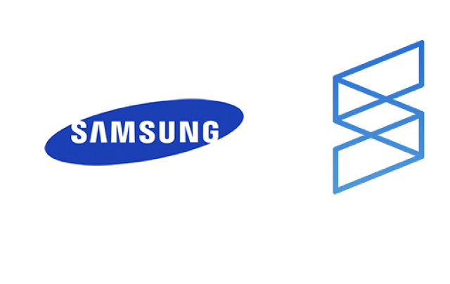
For 21 years, the Samsung name as served as the company logo, occasionally superimposed over a wobbly blue oval. It’s the kind of logo that’s fine on washing machines and…
한 디자이너가 삼성의 로고를 애플이나 마소처럼 아이콘스럽게 디자인한 로고. 개인적으로는 지금보다 훨씬 낫지만 윗분들은 별로 좋아하지 않으실 것 같군요. 결정적으로 어디에서 본것만 같다는게..